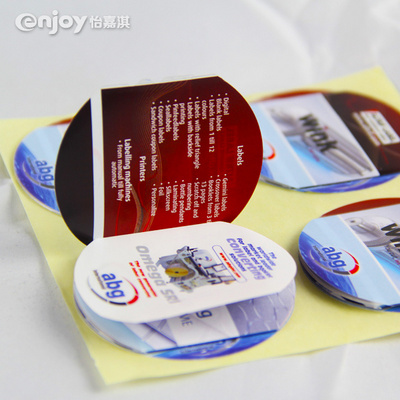
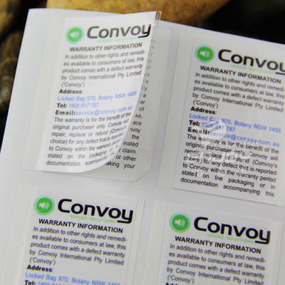
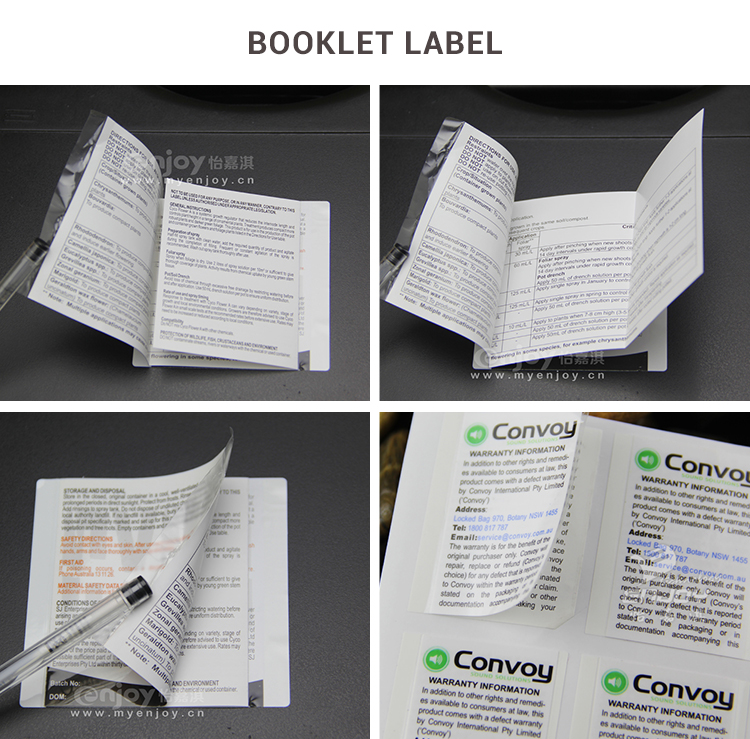
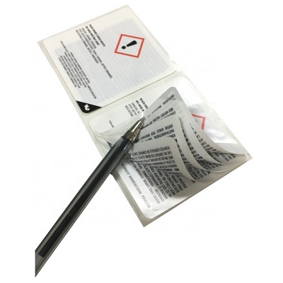
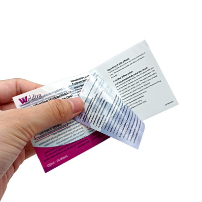
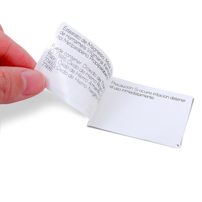
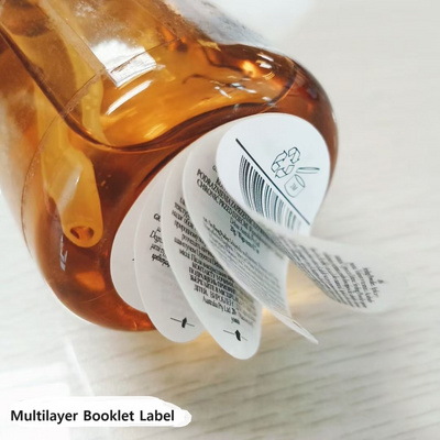
Above picture shows how a booklet label can dramatically improve a product's appearance. The "before" product is a common sight.
Regulatory copy overshadows the brand identification and benefit statements. SK's label doesn't stand out. It's packed with copy
and very little white space. It almost looks dangerous to buy with all that legal regulatory copy screaming for attention. As a
consumer, I would walk right past this product because it doesn't look friendly. The "after" product shows great improvement. The
non-selling, intimidating regulatory copy is hidden inside the Booklet Label. The "after" product has a more prominent brand name
and logo. More copy space has given the company designers a chance to add a beautiful color pattern. And, the benefit statements
are bigger helping to explain why the customer should buy the product. The new package is far more appealing. The use of a booklet
label has given SK the opportunity to change its image allowing it to stand above the competition. This is one of the many ways a
Booklet Label you achieve your desired product image.
Any interest? if any questions please do not hesitate to contact us, looking forward to establish the cooperative relationship
with you..


